Scaling KITS with a design system built for speed and consistency
Feb 1, 2025
KITS
Built and scaled KITS’ design system from scratch, then transitioned to a third-party foundation to support a growing volume of product and campaign work. Now used daily by design and engineering to ship faster and more consistently.
Role: Product Designer
With: PM, CTO, Dev
Tools: Figma, FigJam, Claude, Google Gemini
Impact
Used across 100% of new product and campaign work
83 pages audited: 18 cut, 28 net-new ecomm components scoped
Accessibility built in from the smallest token, not added later
Reduced design–engineering back-and-forth through shared naming and component docs
Mobile-first approach built into every component spec
Overview
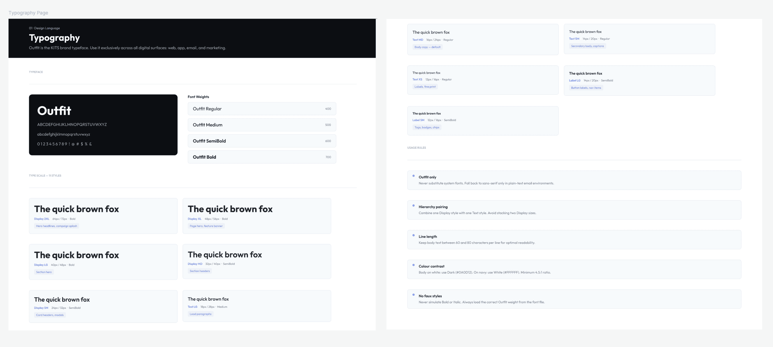
When I joined KITS, I built the design system from the ground up. Colour, type, components, tokens, everything from scratch.
Six months in, I made the call to stop.
Not because it wasn't working. Because I could see where it was going: a system that would grow faster than a lean team could maintain. I adopted Untitled UI as the foundation, a decision that brought us leverage without sacrificing control.
Colours, typography, and CTA were updated immediately so the team could start running. Then came the harder work: auditing 83 pages of SaaS components, cutting what didn't belong, and building out the e-commerce patterns that actually drive the business. That work is still ongoing.
The audit
Untitled UI was built for SaaS. It had charts, calendars, messaging UIs, pricing tier cards. Not all of those are needed at KITS.
I ran two audits in parallel: an atomic inventory of the live site (atoms, molecules, organisms, cross-referenced against Figma), and a content audit of the Figma file (every page evaluated against Keep / Cut / Reduce).
Result: 18 pages removed. 28 net-new ecomm components scoped.
Knowing what to cut mattered as much as knowing what to build.
The audit also made the next step clear: reorganizing the file around KITS's six core ecomm flows instead of component categories, so when a designer opens the checkout page, everything they need is in one place. That's where the system is heading.
Accessibility from the ground up
Accessibility wasn't added later. It was laid into the foundation before a single component was built.
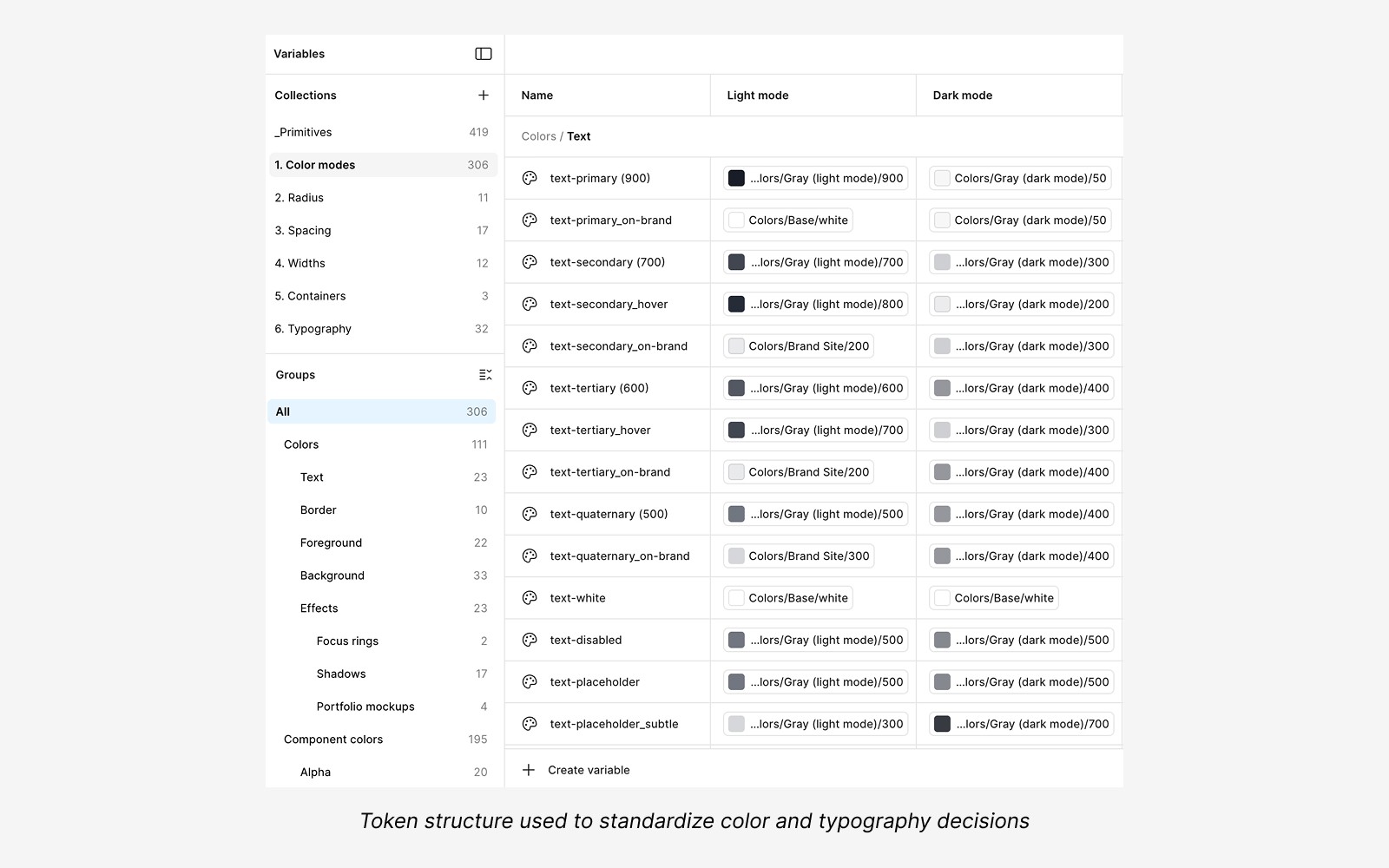
Primitive colour tokens were set against WCAG AA contrast requirements from the start, so every semantic token built on top inherits compliance automatically. Designers pulling a token don't need to check contrast. It's already been validated at the source.
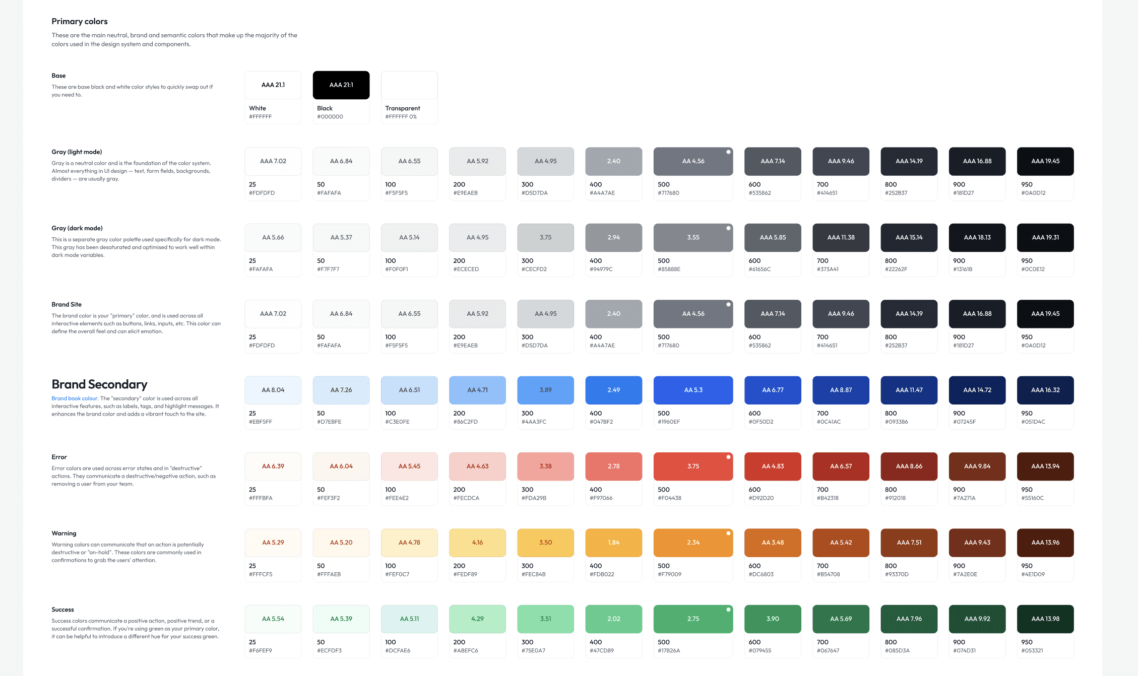
For ecomm specifically, I extended the semantic layer with commerce-intent tokens: price-regular, price-sale, badge-urgency, swatch-selected, swatch-unavailable. Tokens that carry product meaning, not just colour values, which makes components self-documenting and the system more legible to engineering.
The same thinking applied to touch targets, focus states, and interactive states across components. These aren't edge cases to handle at QA. They're part of the spec.
Thinking ahead: the future-proofing challenge
The hardest part of systems work isn't building for now. It's building for what you can't fully see yet.
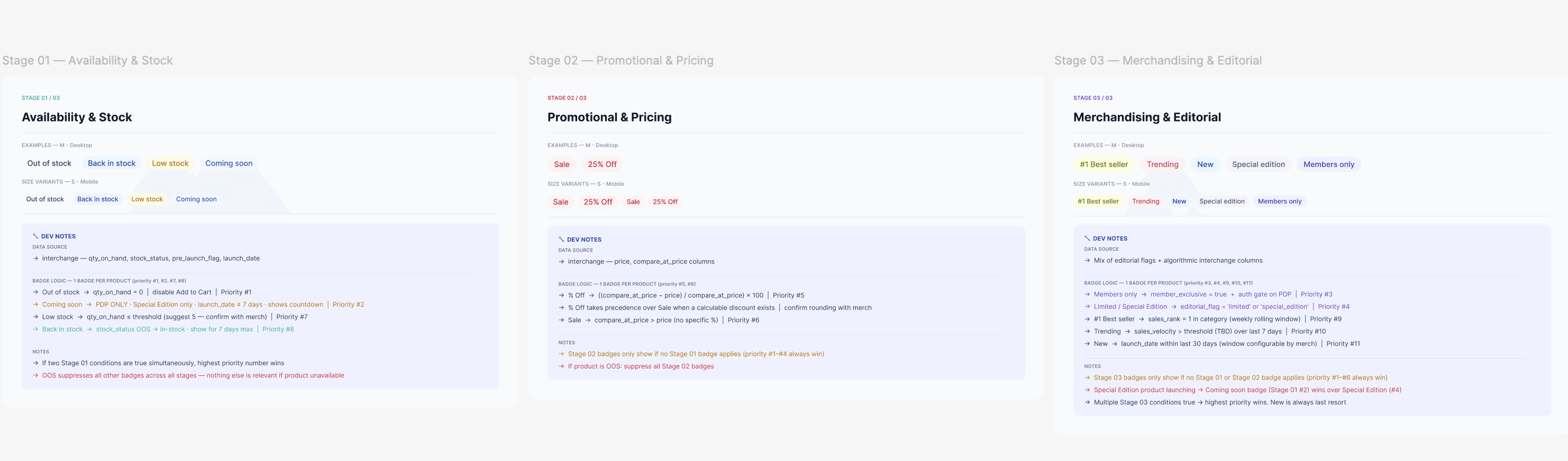
When marketing raised a ticket to add a "Sale" badge to the Product Card, the obvious answer was: add the badge. But that's not how I approach it.
I looked at the request as a signal. If we need a Sale badge today, what else are we going to need? Urgency labels. Low stock indicators. Member-exclusive tags. New arrivals. Each one a one-off if we're not careful, or a scalable pattern if we design it right.
I proposed a badge system instead of a badge. A flexible component with defined variants, token-level colour assignments (badge-urgency, badge-promo, badge-new), and clear rules for when each applies. Marketing gets the Sale badge. Engineering gets a pattern they can extend without coming back to design for every new label. The system stays lean.
That's the thinking I bring to every request. Not "what does this ticket ask for" but "what does this ticket tell me about what the system needs."
Making it easy for engineering
A design system is only as good as how well it translates to code.
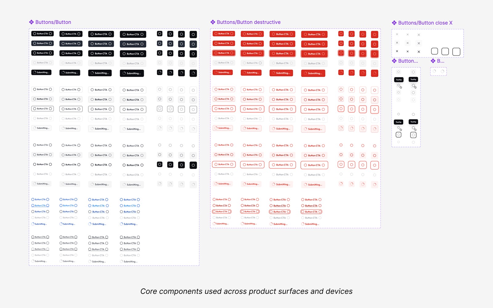
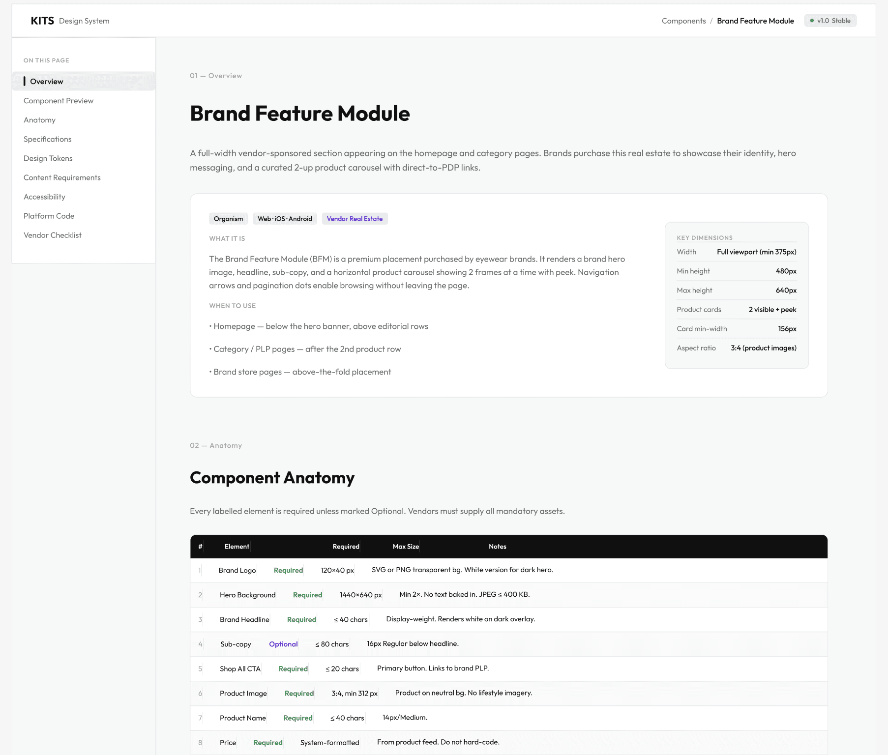
Token names in Figma map directly to variables in code, no translation layer, no ambiguity. Every component page follows the same structure: Overview, Component Preview, Anatomy, Specifications, Design Tokens, Content Requirements, Accessibility, Platform Code, Vendor Checklist. Engineers know exactly where to look. They don't need to ask.
I use AI to make this thorough without making it slow. Claude stress-tests edge cases, which frees me up for the judgment calls.
The rule: If engineering has to ask, the documentation needs to be improved.
Mobile-first by default
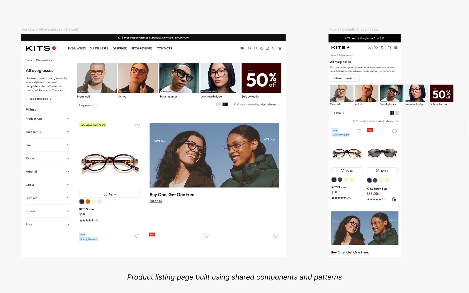
80% of KITS users are on mobile. So that's where I design first.
Every component is built for the smallest screen before it scales up. Touch targets, scroll behaviour, truncation, tap states, these aren't adaptations of the desktop experience. They're the starting point.
The system reflects that. Components are specified mobile-first, with desktop as the extension. Not the other way around.
The next ambition is taking that mobile thinking further. Virtual Try-On is one of KITS's most distinctive features, and it deserves to live as a native app, not a mobile web experience. That's the platform work I want to do next: understanding where the system needs to evolve to support a true iOS product, not just a responsive one.
Reflection
I think in systems. Every ticket is a signal. Every request is a pattern waiting to be named.
The Sale badge taught me something I keep coming back to: the best time to future-proof a decision is before anyone's asking for the second version. By then you're already retrofitting.
The ground-up build gave me the foundation. The Untitled UI call gave us speed. The audit gave us clarity. The ecomm work is still going, because a good system is never done, it's just better than it was.