
Checkout simplification for prescription commerce
Oct 1, 2025
KITS
I led the end-to-end design execution to reduce friction in a uniquely complex eyecare flow. The goal was to make checkout feel shorter and clearer while meeting regulatory requirements and supporting both glasses and contacts.
Role: UX designer
With: CEO, UX director, Engineering, PM, Data analyst
Tools: Figma, ContentSquare, Power BI, Framer
Context
Prescription eyewear checkout is not standard e-commerce. In certain US states, customers are legally required to verify a valid prescription before purchase, and the experience differs depending on whether they're buying glasses, contacts, or both. Customers may also be purchasing for multiple family members, each with different prescriptions and verification requirements.
Before this work, the flow supported all of these requirements — but at a cost. It was long, dense, and difficult to scan. Users weren't abandoning checkout because they lacked intent. They were slowing down, backtracking, and dropping off at the point where complexity peaked: prescription verification on mobile.
This was a cross-functional project worked directly with the CEO, UX Director, Engineering, PM, and a Data Analyst. The brief was to reduce friction. The real challenge was doing it without simplifying away the regulatory requirements that existed for good reason.
The result: a sustained +17% lift in checkout completion, with the biggest gains on mobile.
Design approach
The redesign was built on a single structural reframe: checkout as a sequence of clear tasks, not a single long form. Each phase had one job, one decision, and one way forward. The work focused on three things:
Reducing visual and cognitive load per screen without removing required steps
Making prescription verification feel like a guided task rather than a compliance obstacle
Allowing users to review and edit critical information without leaving the flow
The hardest constraint was regulatory. Some steps couldn't be removed or reordered, they had to stay where they were for legal reasons. The design challenge was making required steps feel purposeful rather than burdensome.
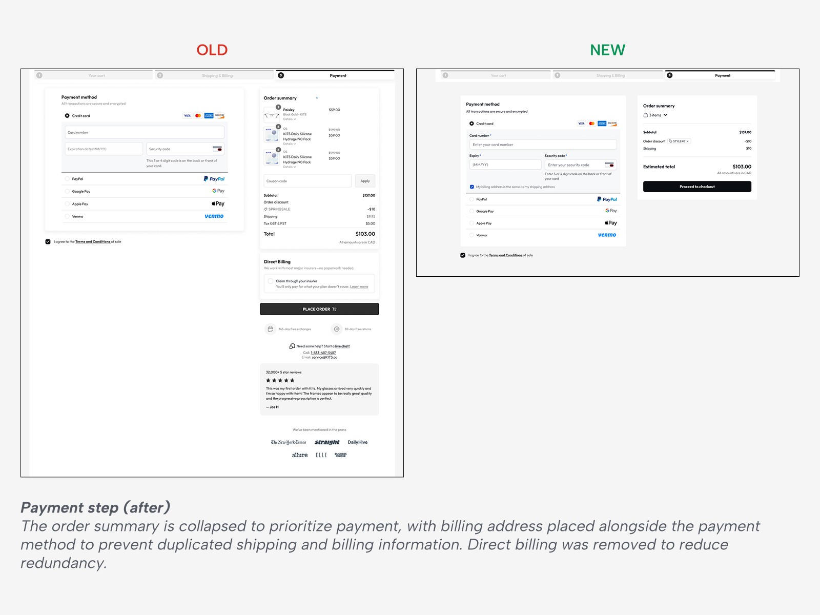
Shortening Without Removing What Matters
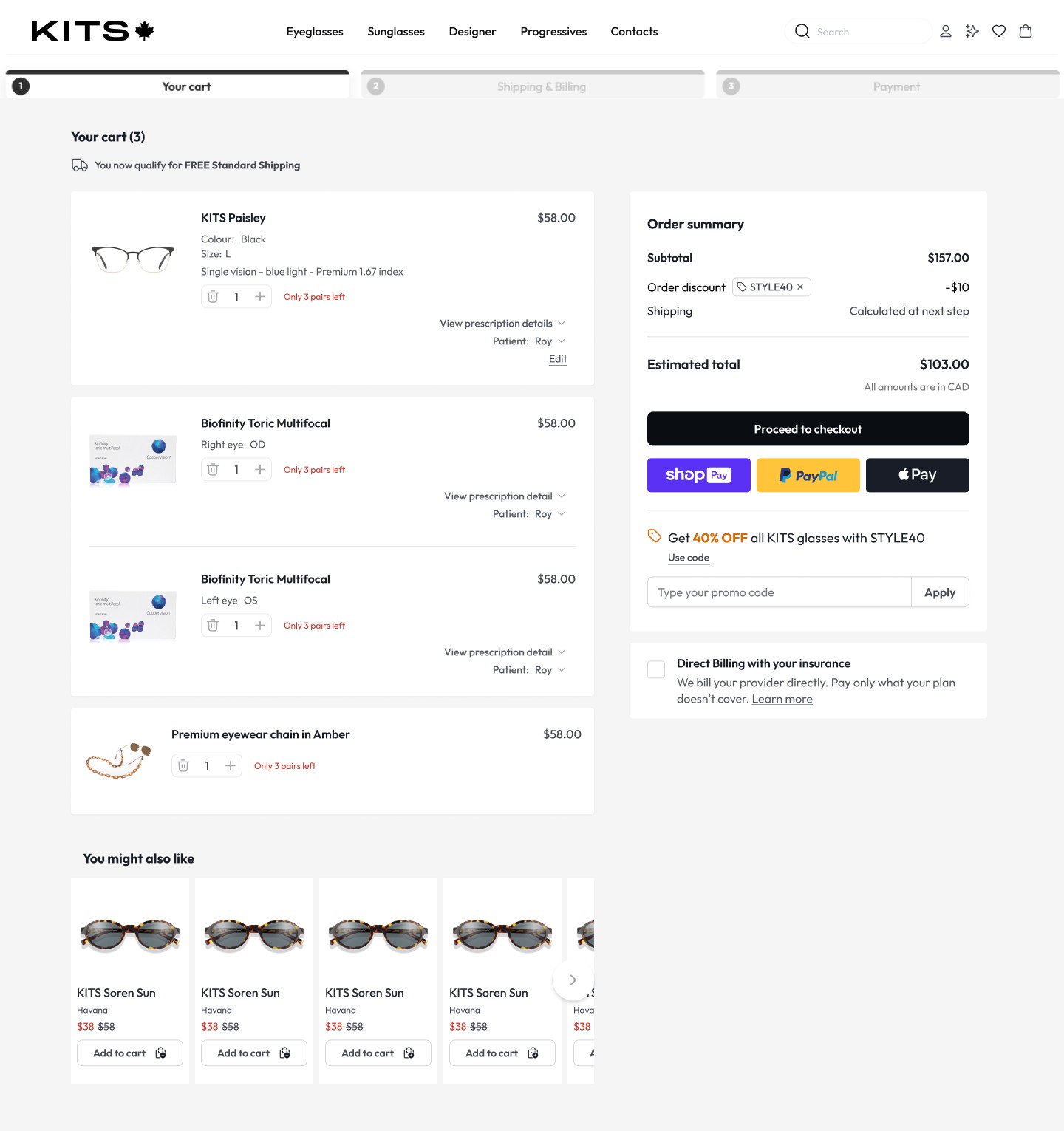
The flow was restructured into clearer sections with stronger visual separation. Shipping options were simplified and labelled more clearly, allowing users to quickly understand what was included and move forward without hesitation. Scroll depth on mobile decreased without any reduction in the information available.
The flow should feel shorter because it's clearer, not because anything important was cut.
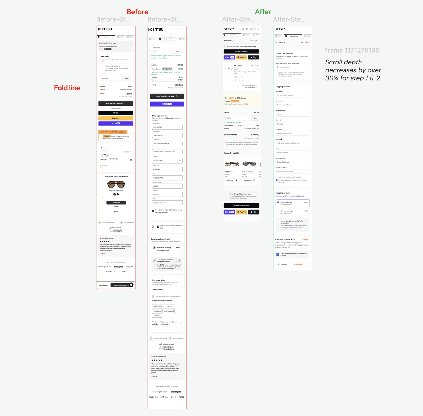
Designing for mobile-first behavior
Almost all drop-off was happening on mobile, not because of intent, but because the checkout was a desktop form scaled down. Mobile breaks when it asks users to process too much at once. Users don't abandon; they lose their place.
The redesign treated each phase as a distinct mobile task with one clear job and one clear next action. Key decisions:
Progressive disclosure: Each step surfaced only what was needed in that moment. Prescription details appeared at the point of decision, not upfront.
Bottom-anchored CTAs: Actions stayed within thumb reach throughout, no scrolling to confirm and continue.
Persistent progress visibility: A lightweight indicator stayed visible across steps so users could trust the system knew where they were.
Inline prescription review: Backtracking on mobile is a conversion killer. Users could verify accuracy without leaving the flow.
Prescription visibility at the point of decision
A key improvement was allowing users to view prescription details directly within checkout, for both glasses and contacts. This reduced anxiety around accuracy and removed the need to backtrack to product or account pages mid-purchase.
Prescription verification was designed as a guided task, with clear status indicators showing what was required, what was pending, and what was complete. This was especially important for users managing prescriptions for multiple patients, where the complexity multiplied quickly.
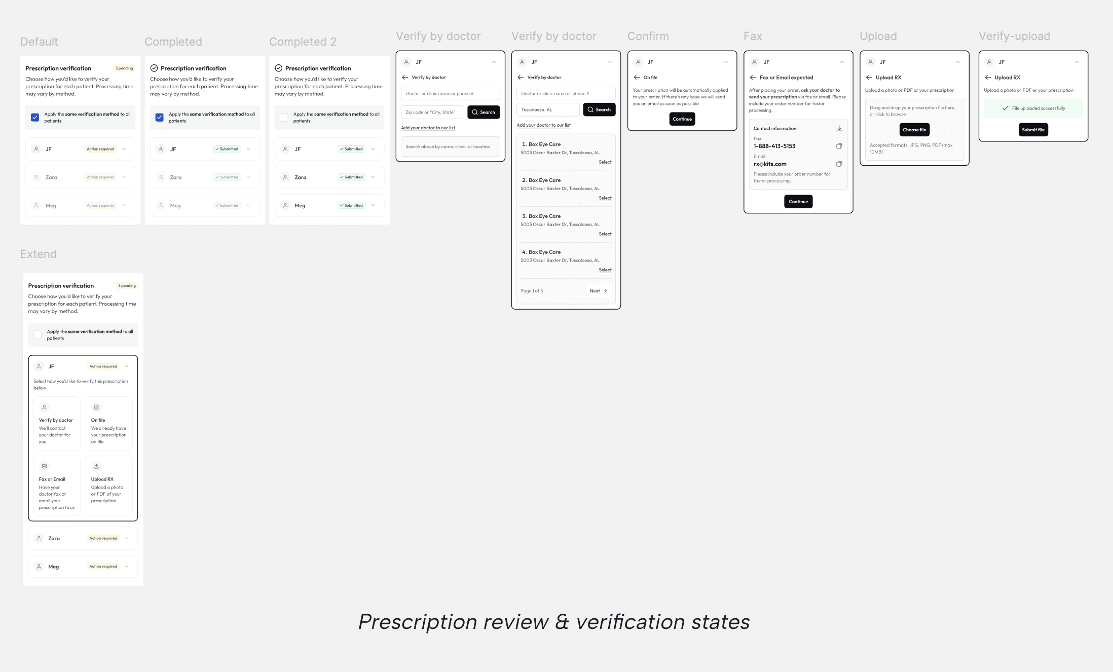
Designing for glasses and contacts
Because glasses and contacts have different verification requirements, the UI adapts based on product type while maintaining a consistent structure. A user buying both in the same order sees a coherent experience, not two different systems stitched together.
This ensured compliance without fragmenting the experience or forcing users to relearn the flow mid-checkout.
Outcome
The redesigned checkout feels shorter because it is clearer. Users can move through required steps with confidence, review critical information at the right moment, and complete prescription verification without unnecessary repetition. The system balances regulatory requirements with usability, improving efficiency at the most sensitive point in the funnel.
Complete view on KITS.ca
Impact
Checkout completion on mobile glasses increased by 7–8 percentage points, a sustained ~17% lift, not a spike.
The gains were concentrated on mobile, where the structural redesign had the highest leverage. Desktop saw incremental improvement; mobile saw a step change. This confirmed the hypothesis that friction wasn't caused by lack of intent, users wanted to buy, but by a flow that wasn't built for how they were actually using it.
The result: a checkout that feels shorter because it is clearer. Users move through required steps with confidence, review critical information at the right moment, and complete prescription verification without unnecessary repetition. Regulatory requirements and usability are no longer in tension.