
PLP optimization for confident product discovery
Nov 20, 2025
KITS
As KITS grew from a small internal frame line to 50+ designer brands, our Product Listing Page (PLP) became a barrier — cluttered layouts and inconsistent data made discovery overwhelming. I led a data-driven redesign of the PLP to help users confidently find and compare products earlier, reducing guesswork and increasing conversions.
Role: Product Designer & Design Owner
With: Product, Engineering, PM, Brand
Tools: Figma, ContentSquare, Power BI, Framer, ChatGPT
Context
KITS’ Product Listing Pages (PLPs) act as the primary entry point for prescription eyewear discovery, particularly for new customers. Glasses require users to make multiple confidence-heavy decisions (fit, prescription compatibility, lens type) before committing to a PDP click.
While downstream conversion was strong once users entered the purchase flow, early-stage metrics suggested friction during discovery, particularly for mobile users, who made up almost 70% of traffic.
Research & Insights
Using ContentSquare, I analyzed scroll depth, exposure, and navigation patterns to understand where users were getting stuck.
Three recurring friction patterns emerged:
Low discovery efficiency
Most mobile users never reached content below the fold, meaning a large portion of the assortment was rarely seen.
Browse hesitation
Users often clicked into PDPs and returned to the PLP without progressing, suggesting uncertainty rather than lack of interest.
Inconsistent attribute data
Sizing, brand, and feature data varied across products, making filtering and comparison unreliable.
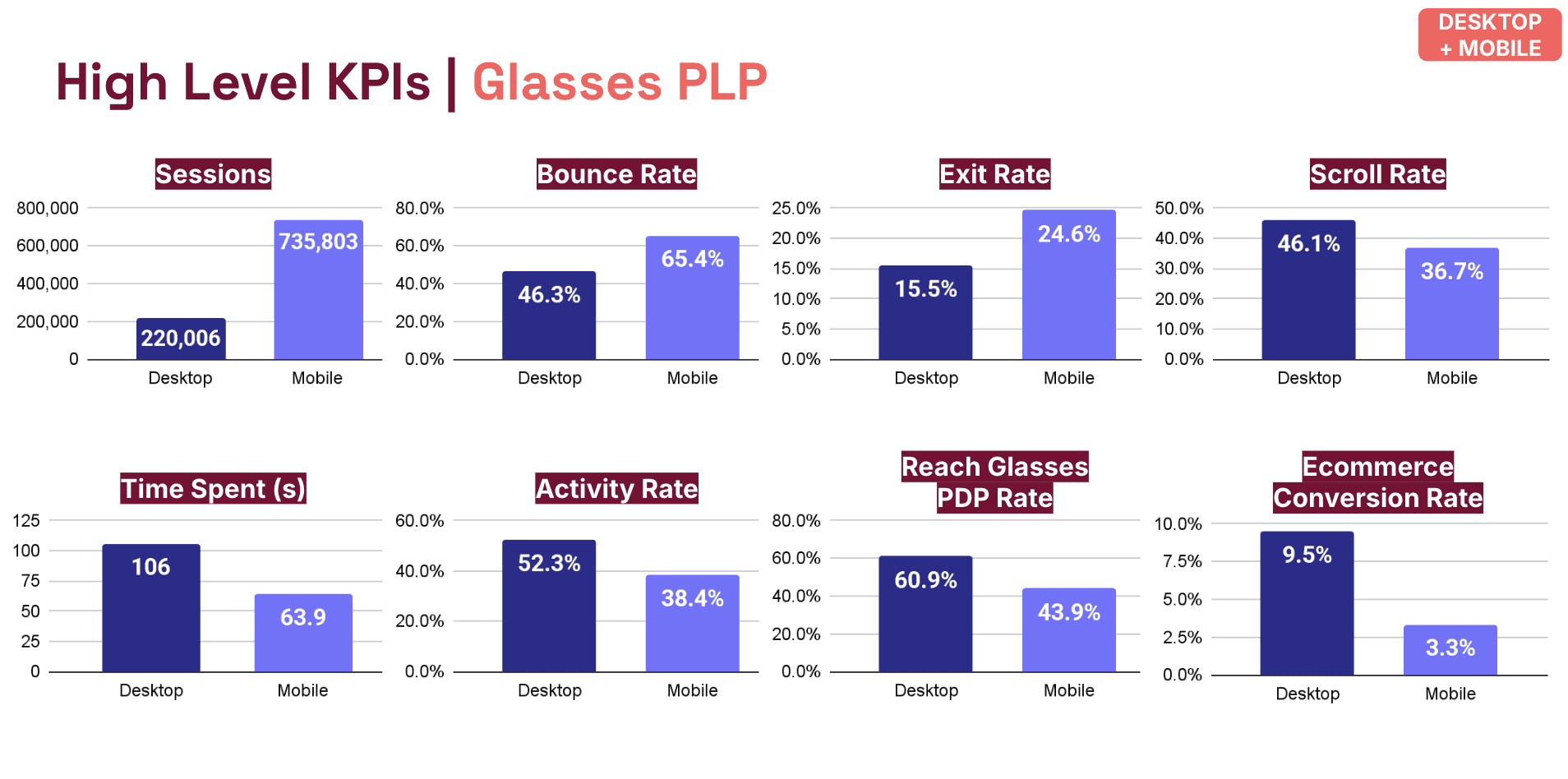
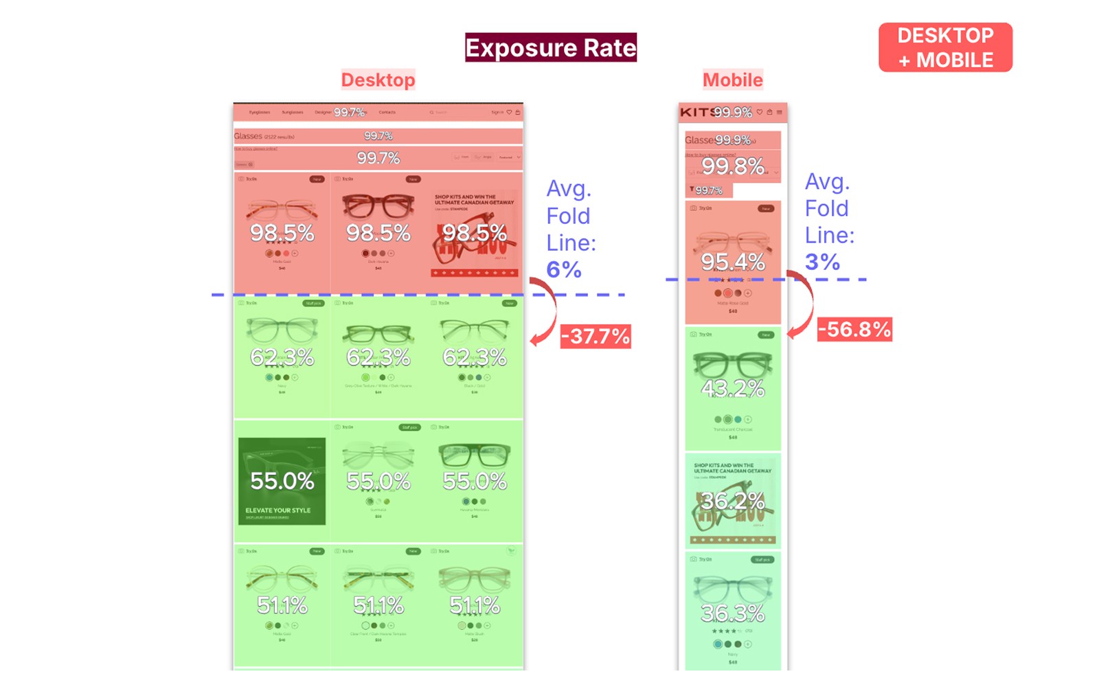
Baseline PLP Performance & Device Disparity.
Mobile drives the majority of Glasses PLP traffic but underperforms desktop across engagement and downstream progression, highlighting a high-leverage opportunity for improvement.
These signals indicated uncertainty, but did not conclusively explain why, requiring us to frame hypotheses rather than conclusions.
Hypotheses
Based on the research, I formed three working hypotheses:
Surfacing confidence signals earlier would reduce hesitation and improve PDP progression
Clarifying hierarchy and intent would improve discovery efficiency, especially on mobile
System-led guidance would support decision-making without removing user control
These hypotheses guided design decisions and measurement.
Design approach
The goal wasn’t to increase clicks, but to make each interaction more intentional.
The PLP was treated as a decision-support surface rather than a catalogue. Changes focused on clarity, prioritization, and reducing unnecessary effort for users.
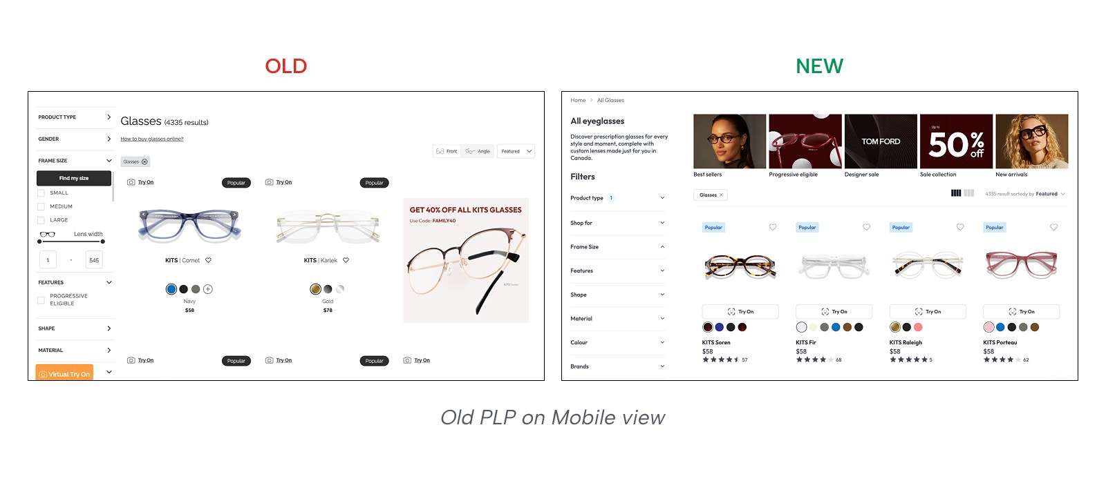
1. Priority and intent
A new header set clear intent and supported SEO.
Introduced collection tiles so users could narrow early and feel in control.
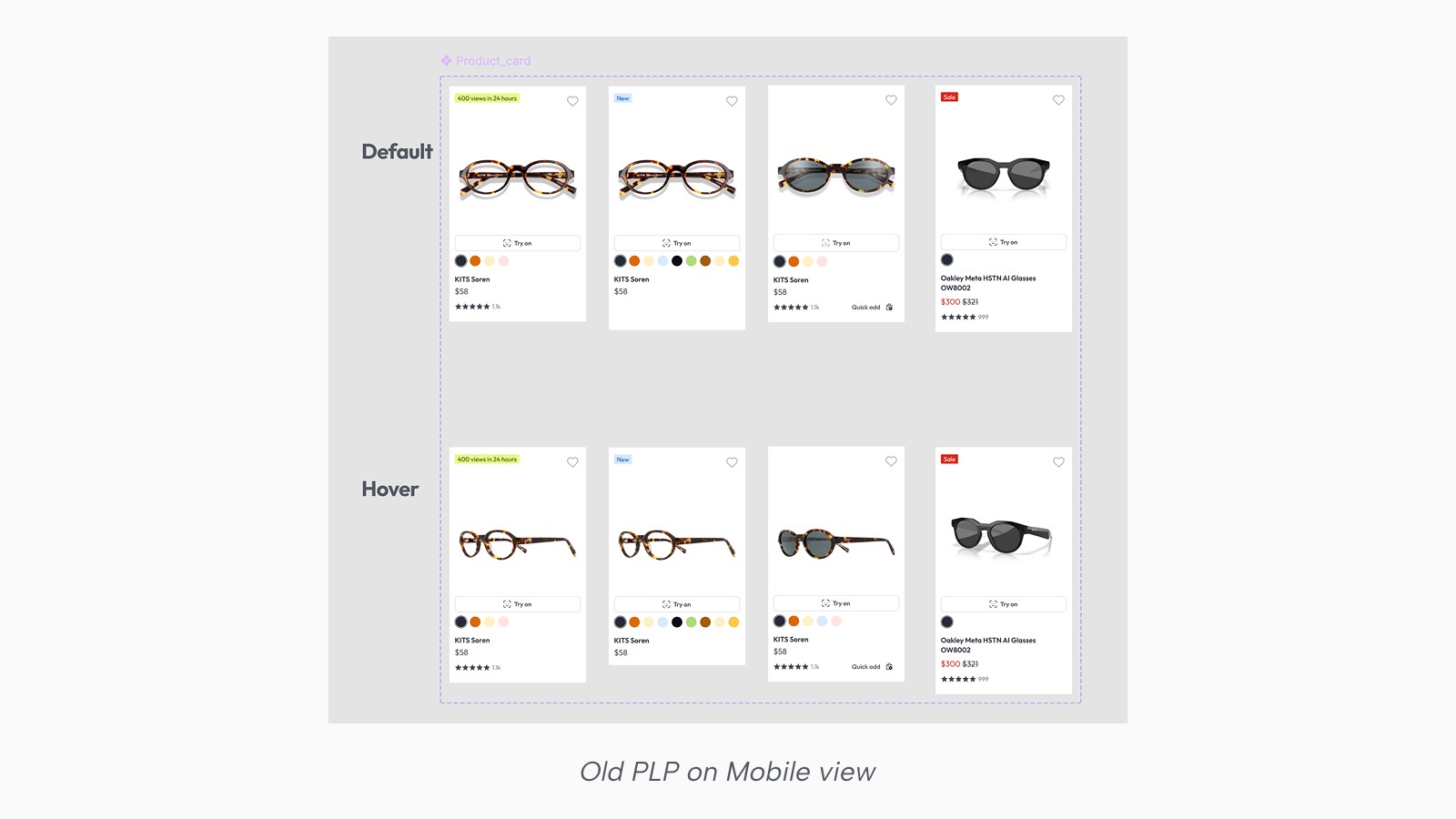
2. Product Cards with confidence signals
Key confidence signals were surfaced directly on product cards to reduce the need for exploratory clicks.
Try-On availability
Ratings
Color swatches placed adjacent to visuals
This allowed users to evaluate options directly from the PLP and decide which products were worth deeper exploration.
3. Better Filters
In the previous experience, filters were hard to discover, dense once opened, and ordered in ways that reflected backend data rather than how people think. Sizing options jumped between Medium, Small, and Large, brand lists were long and unscannable, and it was difficult to tell which filters were active or how to undo a selection.
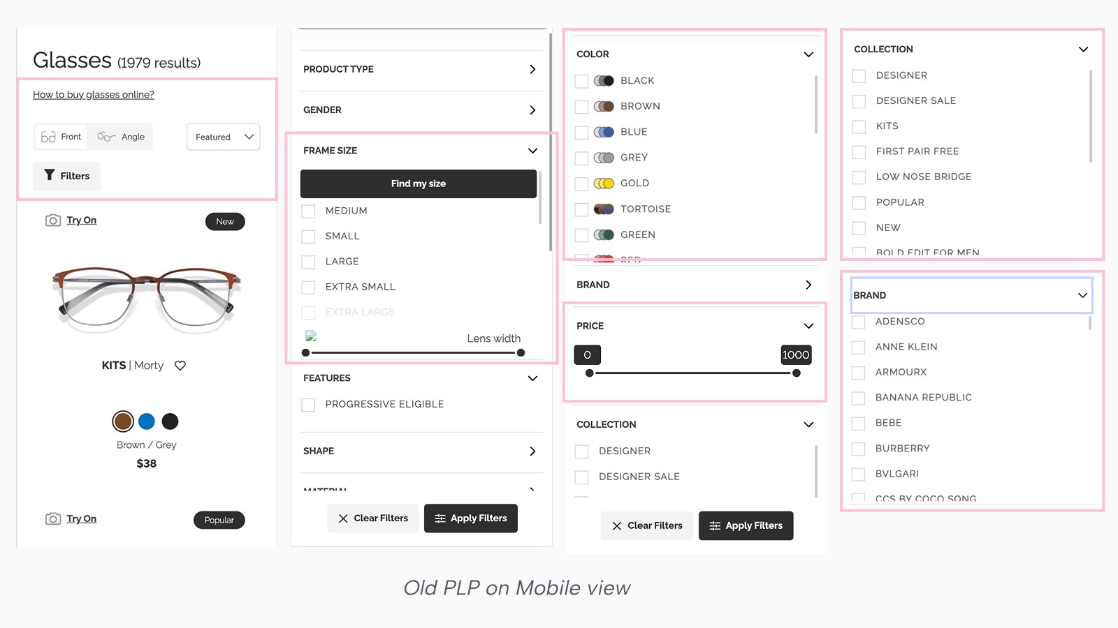
The redesign focused on making filters easier to understand at a glance and more trustworthy as a narrowing tool.
Filters were reordered based on decision relevance, not raw click rate.
Frame sizes now follow a clear small-to-large progression, with KITS frames mapped into standard sizes and designer frames honouring brand sizing when measurements aren’t available.
Dense filters like Brand include search, and every selection provides immediate feedback through count indicators and removable tags.
Putting It All Together
All changes were designed to work together as a single flow — from orientation, to discovery, to refinement — rather than as isolated improvements.
Constrain
The biggest hurdle was organizational. Product Owners often used "Collections" as a dumping ground for seasonal promos, which cluttered the UI and confused the user journey. To consolidate 50+ disparate brands into one space, I established a Rule Table as a fallback logic. This allowed us to map inconsistent backend data, from eye shapes to materials. This gave the tech team full control over messy inventory without sacrificing the elegance of the user experience
Impact: Record high result
PLP to PDP progression for glasses stabilized around the 40% range compaired to ~36% before launch.
Users who engaged with the PLP were more likely to enter the lens flow.
Downstream conversion rates remained strong, indicating improved progression without lower-quality clicks.
These patterns suggested that reducing uncertainty earlier in the journey supported better decision-making downstream.