
Re-architecting navigation & discovery to support a new product line
Jun 1, 2025
KITS
Re-architected KITS’ navigation and discovery system to support new Readers product launch and long-term scale across desktop and mobile.
Role: Product Designer
With: Product Owners, PM, VP Marketing
Tools: Figma, FigJam, Power BI, Microsoft Clarity, Google Gemini, Perplexity
Overview
It started with a simple ask:
“We need to launch Readers.”
The Readers product line was developed and ready for launch, but it became clear that the challenge extended beyond simply adding another category: the existing navigation and discovery system was inconsistent, overloaded, and not built to scale. Readers had never existed in navigation before, so there was no baseline for how users might find or engage with it.
This project was a shipped solution (now live in tech production and ready for launch. It aimed to solve two core problems exposed by the planned launch:
KITS vs Designer confusion: users struggled to differentiate between in-house products and designer offerings.
Lack of clear entry point for a new product line: Readers did not have a predictable place in navigation, leading to discoverability issues.
Our goal was to clarify what users are shopping for and create a discovery structure that is both scalable and intuitive as the system grows.
Primary KPIs focus on Reader navigation adoption and funnel continuation, while secondary metrics help identify confusion between KITS and Designer and evaluate whether users clearly understand the new entry point.
Visual evidence
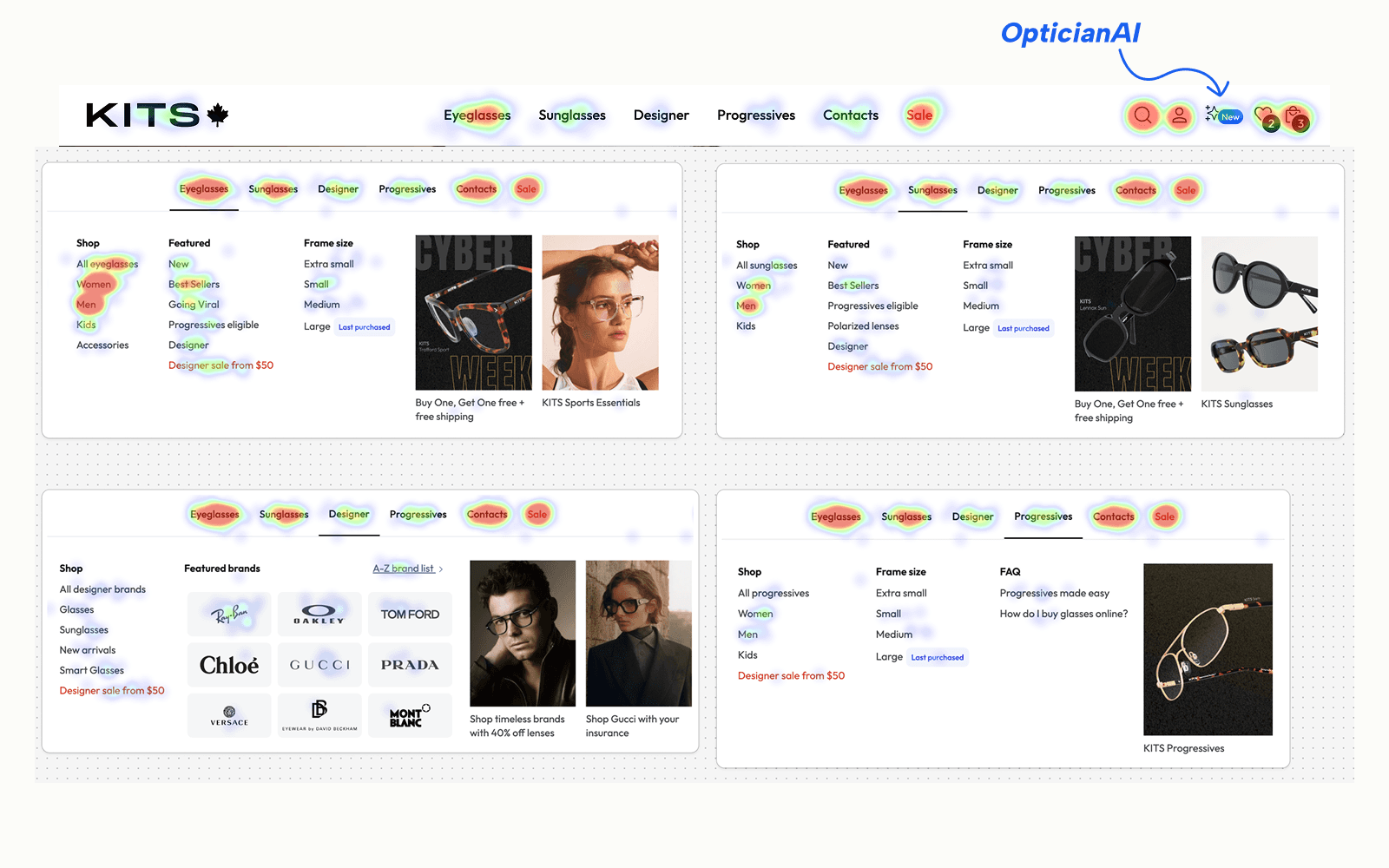
What people actually clicked
Despite dense mega-menus, engagement clustered around a few primary categories (Eyeglasses, Sunglasses, Sale) and simple “shop by” paths. Many links added noise without value.
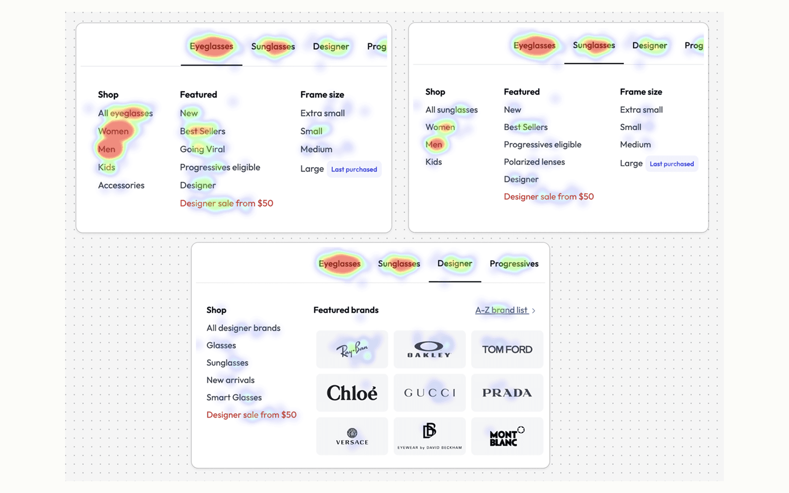
Brand clarity broke down at scale
The Designer navigation was packed but underperforming. Designer collections were scattered, and KITS products weren’t clearly positioned, making expectations fuzzy.
The Approach
Rather than treating each issue separately, I took a system-level approach:
Clarify what users are shopping for
Separate browsing from assistance
Design a structure that could scale beyond this launch
Competitive analysis using AI
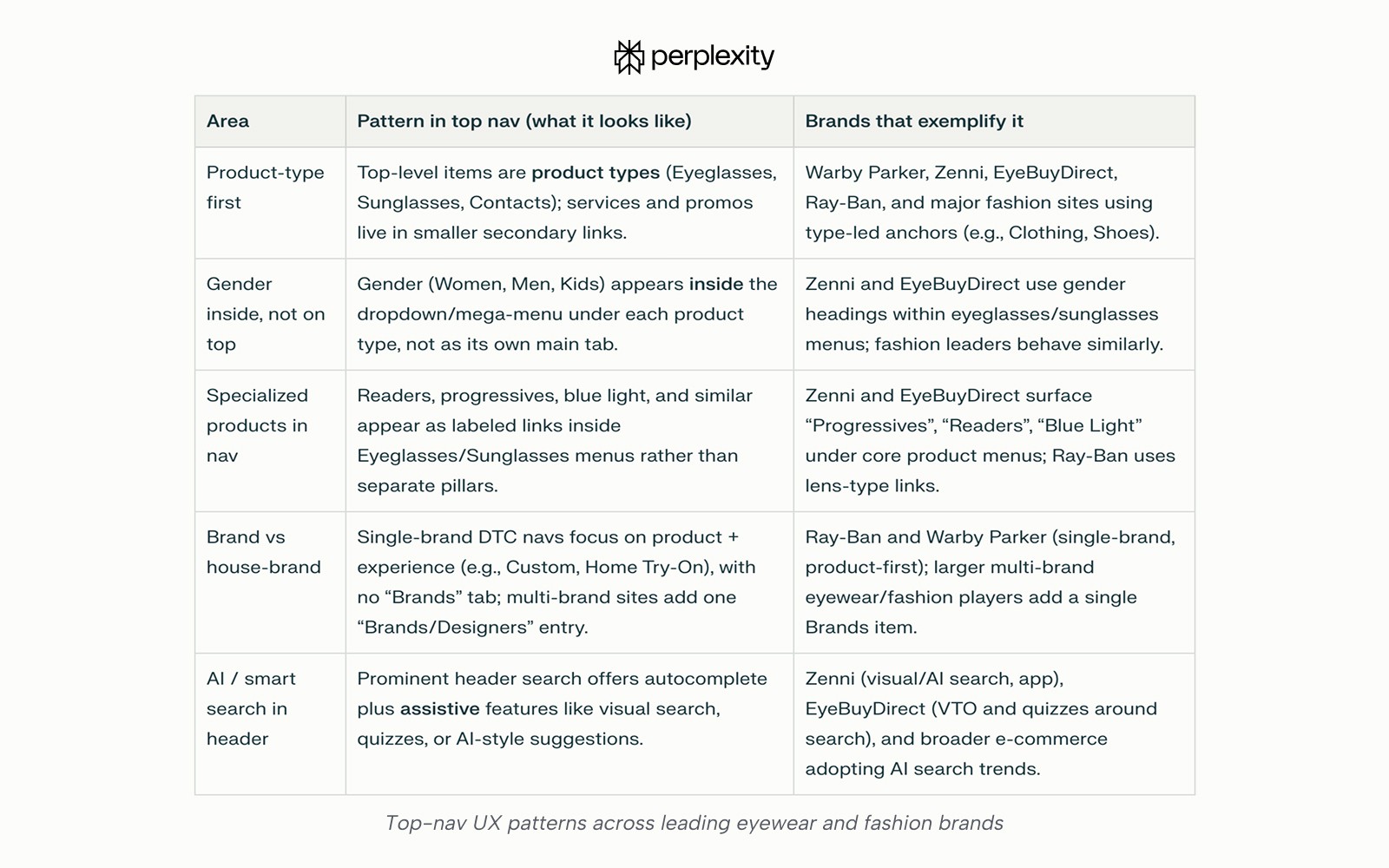
Looking at how other e-commerce and eyewear brands handle navigation and AI reinforced a clear pattern:
Top-level navigation stays focused on shopping intent, while AI and smart assistance work best inside discovery moments, not as destinations.
This helped frame the solution: simplify the system and put help where users actually need it.
What Changed
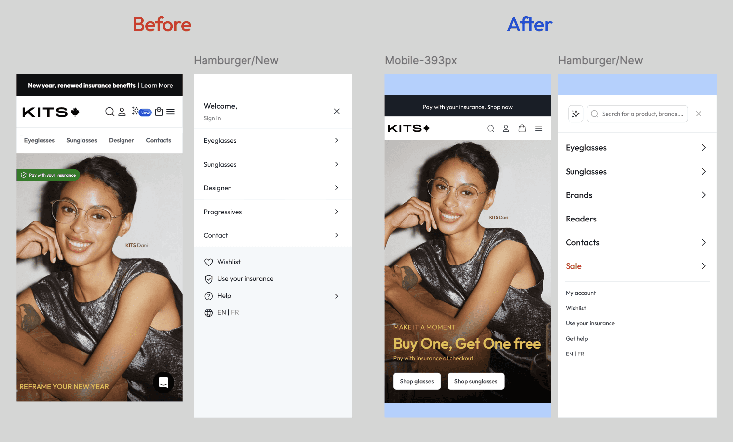
Simplify the icon set based on click rate from 5 to 3 icons
Move search to the top header under the hamburger menu
Optician AI repositioned next to Search to support discovery
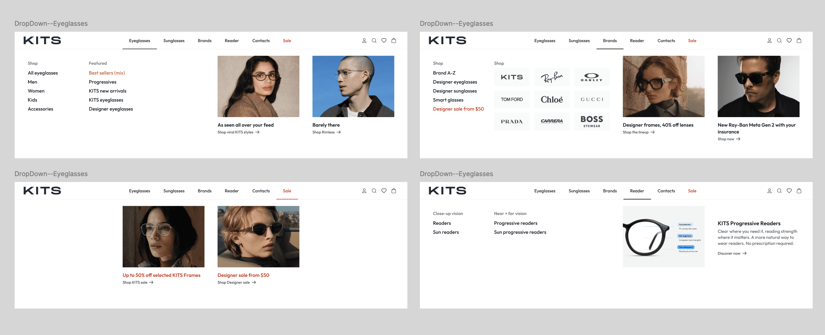
Navigation simplified to Eyeglasses, Sunglasses, Brands, Reader, and Deals, reducing top-level noise and improving scanability.
Readers surfaced as a first-class product line, since they don’t require the standard lens flow. Educational content in the dropdown helps users quickly understand sub-categories.
Brand browsing unified under Brands, consolidating designer and KITS collections into a single, predictable entry point.
Clear copy distinguishes KITS vs designer products, setting expectations early and reducing confusion before users reach product listings.
Constraints & learning
Navigation changes required cross-team alignment, particularly around consolidating designer categories and positioning KITS within a unified Brands experience. By using structure and clear labelling instead of separate categories, the solution balanced stakeholder concerns while improving user clarity.
Learning: system-level decisions land best when they absorb constraints rather than fight them.
What’s Next / Measurement Plan
This feature is shipped to tech production and prepared for launch. Because Readers is a net-new navigation entry with no historical baseline, success will be evaluated through adoption, clarity, and quality of engagement rather than uplift metrics alone.
Primary KPIs focus on:
Reader navigation adoption: % of sessions where Reader nav is clicked
Funnel continuation: % of Reader nav sessions that proceed to a product list or interaction
Secondary metrics will help diagnose confusion and clarity:
Early exit rate after Reader entry
Cross-category switching (Reader ↔ Designer)
Time to first meaningful action after entering the Reader
Measurement Timing
The feature is shipped to tech production
Tracking will go live at launch
Initial read (1–2 weeks): sanity check and adoption validation
Confident signal (3–4 weeks): behaviour stabilization and clearer engagement patterns
These measurements will establish the first benchmark for the Reader product line and inform future iterations on navigation structure, labelling, and downstream flows.